S&P 500 Fair Value Should Be Higher Than Historical Average
Are higher P/E Ratios Deserved?

The S&P 500 Forward P/E was at 20.34 (As of Aug 6th, 2023). There has been a lot of debate about what the fair value P/E of S&P 500 should be and I often hear a range of 15 to 17 as the fair market multiple. Quotes like the following make the case that the S&P 500 should trade in line with historic averages:
The S&P 500 index is trading at a 12-month forward price/earnings ratio of 19.1, well above the 20-year average of 15.8, 30-year average of 16.5, and 40-year average around 16.0.
Source: US earnings recession fades but Wall St is expensive (Reuters)
In this article I am going to make the case for why the S&P 500 deserves a higher multiple than historic averages in today’s world and economy and that at 20.34 next 12 months earnings, it is not expensive and might instead be just about at fair value given the growth ahead of us.
What is the Shiller P/E Ratio:
The Shiller P/E Ratio is a valuation metric that shows the multiple that the current price of a stock or index is trading over its inflation-adjusted, 10-year average earnings. It's also known as the Price Per Earnings ratio, Cyclically Adjusted Price to Earnings (CAPE) Ratio, CAPE.
A lot of this financial language is sometimes hard to grasp, which is why I like to listen to Josh Brown, who in my opinion is the best commentator for retail investors to listen to. He excels in simplifying things and explaining concepts in a digestible way. Listen to him explain Shiller P/E Ratio on The Compound & Friends.
Shiller P/E Ratio has been climbing over time:
As you can see from the chart below, the Shiller P/E Ratio has been climbing over time and you can notice a clear uptick since the 80s. This is very important and will tie into some of the arguments I am going to make later, so pay attention 🙂

Is Shiller P/E Ratio Too High or Is It Deserved?
Like all retail investors, P/E ratio was the first metric I identified, to look for when trying to assess a stock’s valuation. It wasn’t until $COIN fell 80% that I realized that I need to be looking at Forward P/E. With $VALE I learned that different industries have different P/Es and what’s a good P/E for tech is not a good P/E for materials.
But with $AAPL, $TSLA & $NVDA I learned that a high P/E is not necessarily a bad thing. If the earnings can outpace the price growth by a certain margin, higher P/E is an acceptable. Not to mention the fact that stocks like Nvidia have never really been cheap.
So why is it that different industries have different fair value P/E’s and why is it ok for some industries to have higher P/Es?
Because their ability to drive earnings growth are different: A software company has higher margins than a materials company and its ability to scale is extremely high. A software company can scale from 1000 customers to a million customers overnight. An Iron and steel company cannot. An iron and steel company is going to need to manufacture those goods, that can’t be copy pasted like software. It will need to go on trucks, then on ships, then on trucks. The Software company might be on the cloud and literally scale with the click of a button. Large companies with scale might need to set up more servers and other infrastructure but it is nowhere close to producing a car or any hard goods for that matter.
Given this higher margin profile and ability to scale which leads to earnings growth, investors are often willing to pay more for software companies leading to higher fair value P/E.
Why Has The Shiller P/E Ratio for S&P 500 Been Climbing?
Let’s take a look at Just Keep Buying Author, Nick Maggiulli has to say in his article: The Problem with Valuation.
The two main cases he makes are:
The cost of trading has gone down
2. Ease of trading has gone up
Investing today is far simpler and cheaper that it was nearly a century ago. This begs a question: how much annual return would you be willing to give up in 1940 to have all the investment innovations that we have today? I bet it’s at least a few percentage points. And, if this is true across investors in general, then we would expect stock prices to be bid up accordingly over time.
And this is exactly what we’ve seen over the past few decades. If you look at Shiller’s P/E (price-to-earnings) ratio going back to 1920 (chart above), you can see that this ratio has been mostly increasing over the last century.
In fact, before 2000, the average Shiller P/E ratio was 15.5 and since then it has been around 27. This is evidence that investors are willing to bid up prices (and, thus, accept lower returns than their predecessors). Even in March 2009, when things looked the bleakest during The Great Recession, the P/E ratio only briefly dipped below its pre-2000 average (~15) before immediately shooting back upward.
This is why expecting mean reversion in valuation metrics is so misguided. Because the investment industry has changed too much. And investors have responded accordingly. In 1940, a P/E ratio of 15 wasn’t an amazing deal for stocks, but in 2023 it is.
Source: https://ofdollarsanddata.com/the-problem-with-valuation/
Here are some more examples (from the same Compound & Friends podcast I used earlier) of other reasons why Shiller P/E's Ratio Has Been Climbing Up Lately:
Structural Reasons - Cost and Ease of trading - Clip
Interest Rates - Clip
Composition of the index: What’s in the index has changed and it's Not Apples to Apples - Clip
Margins - Clip
Structural Reasons:
Covered in Nick’s POV above.
Interest Rates:
The interest rates thing makes sense but kind of does not: Interest rates have not been particularly low since 1980.
As you can see from the chart below, interest rates remained quite high until 2000 however the Shiller P/E Ratio has been climbing since the 1980s. However, interest rates from 1990 to 2000 were lower than the last 3 decades & for the 2010 and 2020s, interest rates were very low, which aligned with the spike in the Shiller P/E Ratio.
So ok, I’ll allow it. I agree that interest rates are playing a role in the rising Shiller P/E Ratio.
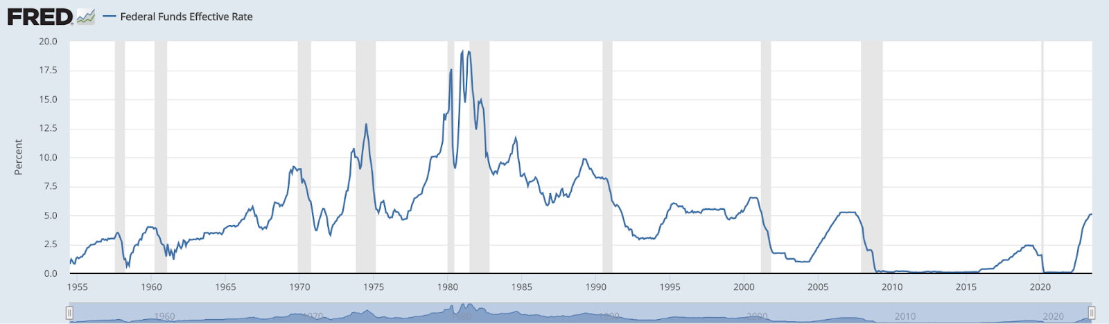
Source: https://fred.stlouisfed.org/series/FEDFUNDS
Composition of the index
The composition of the index has changed drastically. Here is some history.
The S&P 500 was created in 1957 - Prior to S&P 500, there was a predecessor index called the Standard Statistics 90, which was created in 1926.
The sector composition of the S&P 500 companies in 1957 was as follows:
Industrials: 425 stocks (85%)
Utilities: 60 stocks (12%)
Railroads: 15 stocks (3%)
The sector composition of the S&P 500 companies as of Aug 6th is as follows:
IT - 28.1%
Healthcare - 13.1%
Financials - 12.6%
Consumer Discretionary - 10.6%
Communications Services - 8.7%
Industrials - 8.5%
Consumer Staples - 6.6%
Energy - 4.3%
Utilities - 2.6%
Materials - 2.5%
Real Estate - 2.5%
It’s clear the index is very different today than it was in the past and businesses that can grow much faster make up a much larger chunk of the index today. I don't see any reason to expect the same P/E multiple when the underlying is so different.
To read more about how the index has changed since launch, check out this blog which details it with good visuals.
Margins:
Higher margins, which is triggered by higher scalability and low cost of expansion, should also lead to higher EPS Growth rates over time but this is where things don’t add up for me.
The following two charts are not adjusted for inflation.
We are looking at EPS growth rates since 1960 and as you can see I don’t see any clear trend of increased EPS in either the YoY chart or the 10 Year average chart.


Data Source: https://pages.stern.nyu.edu/~adamodar/New_Home_Page/datafile/spearn.htm
The takeaways from the EPS Growth Rate analysis are:
The stock market had elevated EPS growth in the 70s, which somehow happened to be the decade with the highest fed fund rate (see fed funds rate chart earlier in the article).
The EPS Growth rate has swung more wildly YoY in the more recent decades, while being more stable when comparing 10 year averages in recent decades.
While we could not clearly establish this using EPS growth rates, this needs further investigation and I will come back to this topic in the future with more data. I want to say I see a slight uptick 2005 onwards but need more data to prove my case.
Conclusion:
I conclude that the S&P 500 Fair Value multiple should be higher and not at the 10 year average of 17 as some like Holly Newman Kroft at Neuberger Berman Private Wealth suggest (Source: Squawk on the Street - Aug 8th, 2023).
Here is a YouTube clip from Fundstrat's Tom Lee Making the case for 20 times P/E.
Historically it’s nirvana for P/E, the P/E should be closer to 20 times if we can see the 10 year can stay around 4%.
A summary of the reasons we discussed:
Structural Reasons - More people in the markets, cheaper to trade, etc…
Lower Interest Rates in the last decade
What’s in the index has changed and it's Not Apples to Apples
Margins - TBD
Waiting for the market to come back to that multiple might lead to opportunity cost.
Dollar cost averaging into the market would work a lot better under these circumstances when we don’t know if the market will go higher or lower, which is always the case, isn’t it?
If you are looking for ideas, then here are some ETFs that I have put my investments in.
Past performance is no guarantee of future results.
The ideas discussed in this article should not be constituted as investment advice.
Disclosure: We own positions in some/all of the tickers mentioned in this article.